Deepset
Elsie Ramsey | Graphic Design

Designs
Flirtual
Flirtual is a fictional company I was assigned to develop a business plan for and to design a logo, an icon set, and two screens for the app. Additionally, we were to create three separate directions that the client could choose from to then be their final look.

Business Summary
Given the way the world has gone the last few years, dating in the real world may become increasingly impaired. Going on a real, in person date could become more of a hassle than it already is. Having to deal with potential mask and vaccine mandates (depending on where you live) isn’t exactly romantic. Enter, Flirtual. The dating app that allows you to meet AND go on dates with people virtually.
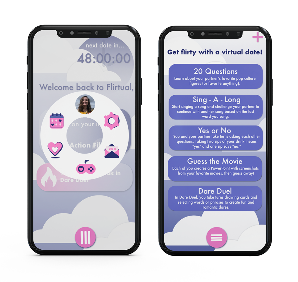
Cloud 9
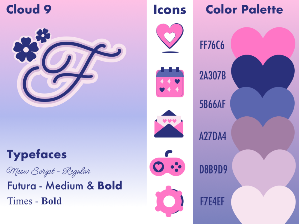
Cloud 9 caters to the idealistic side of dating and romance. That feeling of being on Cloud 9 after a date that’s gone really well. This being a virtual experience shouldn’t stop the real feelings you’d have on an in-person date. To pair with that, I used a dark blue, like midnight, and hot pink, for sunset or sunrise (just a few settings that might pop up on a date). The recurrence of a script typeface and heart motifs was used deliberately to stray from the contemporary dating apps today.
Showcases light gradients to keep up with the current direction of app design as well as use of widgets and an intuitive menu layout.
The dashboard allows you to see relevant notifications to your profile upon opening. From there the menu gives you quick access to the rest of the features that the app provides.
The virtual date screen displays your options for virtual dates and games to play with another person. You scroll through the choices and tap one to select it and set up the date from there.
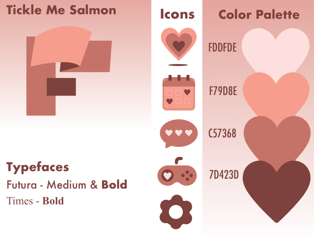
Tickle Me Salmon
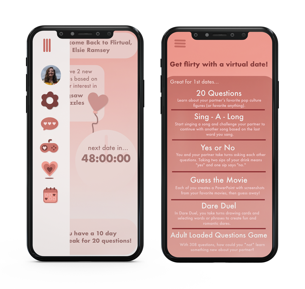
Tickle Me Salmon is more the direction for those who have a busy lifestyle and are sitting down when they get the chance, maybe with a glass of wine, to browse their date options. The monochromatic color scheme to appeal to a more mature dating audience. It’s limited, controlled and contained. All the makings of a quiet and enjoyable date. I used the salmon pink and ripple in the logo to emote a sense of satin and ribbon.
Features light gradients to keep with current design trends and makes for smooth transitions in between screen selections and menu use.
Hollaback Retro
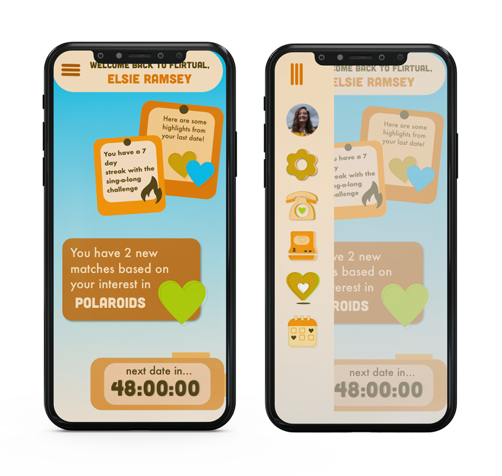
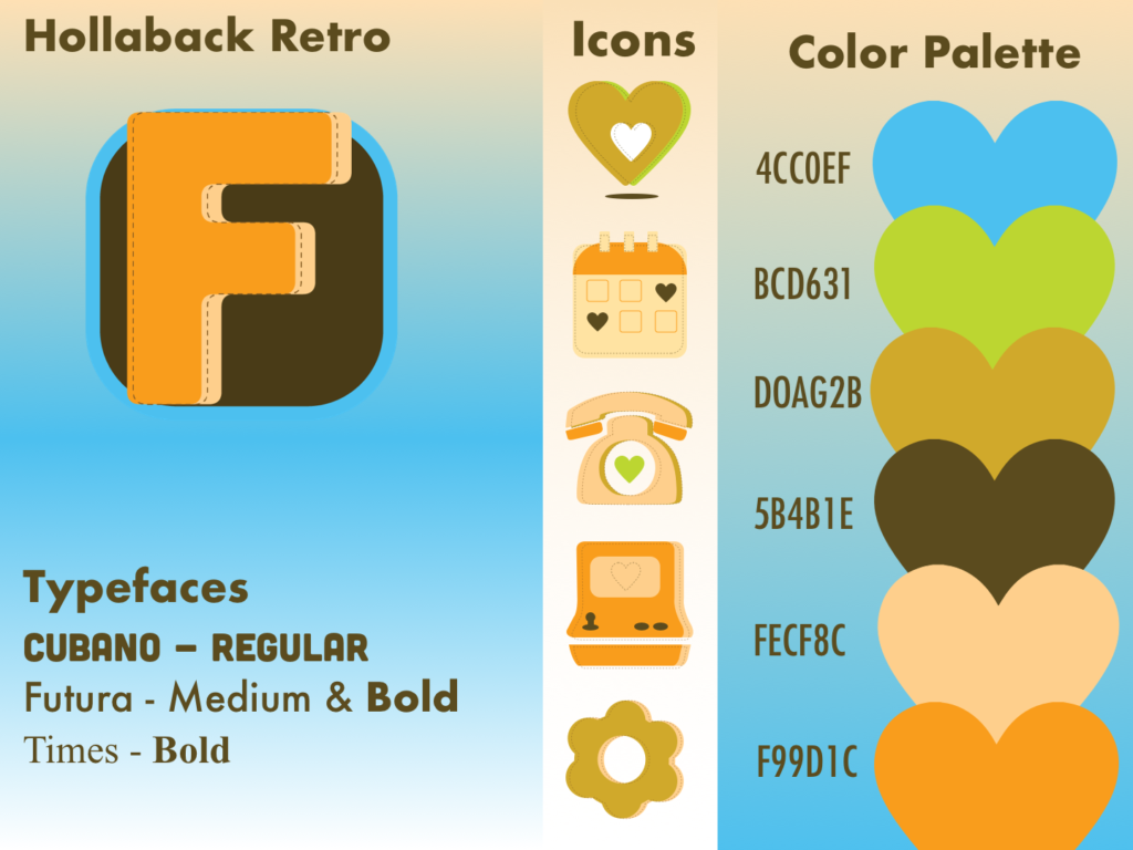
Hollaback Retro is a much different direction. It showcases more of the advancements we’ve made in not only technology but the way which we communicate to one another. The colors chosen were inspired from primarily 70s interior, as well as clothing, colors. The icons are more emotive of earlier technologies as well.
These screens have a vintage theme with contemporary design elements such as gradients, widgets and an intuitive menu and notifications.
The dashboard allows you to see relevant notifications to your profile upon opening. From there the menu gives you quick access to the rest of the features that the app provides.
